How to Create a High-Converting Landing Page in 2026: The Complete Guide
Summarize this blog with AI:
A landing page has one job: get visitors to take action.
That action could be signing up for a free trial, booking a demo, downloading a resource, making a purchase, or submitting a form. But getting someone to click on your page is only the beginning. The real challenge is convincing them to stay, understand your offer, trust it, and take the next step.
A beautiful design alone won’t make a landing page convert. Neither will clever copy or a prominent CTA.
High-converting landing pages bring several elements together: a clear value proposition, relevant messaging, persuasive copy, strong visual hierarchy, trust signals, a focused call to action, and a frictionless user experience.
And there is no single template that works for every business. A landing page for a Google Ads campaign may need a different approach from a SaaS product page, lead-generation campaign, or free-trial offer.
In this guide, we’ll break down how to create a high-converting landing page from the ground up—including the structure, copy, design, CTAs, conversion optimization, A/B testing, SEO, personalization, and AI-powered tools that can help you build and improve pages faster.
By the end, you’ll have a practical framework you can use to plan, build, launch, and optimize a landing page that turns more of your traffic into meaningful conversions.
Table of Contents
- What Is a Landing Page?
- What Makes a Landing Page High-Converting?
- The Essential Elements of a High-Converting Landing Page
- How to Write Landing Page Copy That Converts
- How to Design a Landing Page for Better Conversions
- How to Create a High-Converting Landing Page Step by Step
- Landing Page Optimization and A/B Testing
- Landing Pages for Google Ads, Lead Generation, and SaaS
- Landing Page SEO: How to Get More Organic Traffic
- How AI Is Changing Landing Page Creation
- Common Landing Page Mistakes to Avoid
- High-Converting Landing Page Checklist
- Frequently Asked Questions
1. What Is a Landing Page?
A landing page is a standalone web page created for a specific marketing campaign, offer, or conversion goal. Unlike a homepage, which introduces visitors to an entire business, a landing page is built around a more focused purpose.
A visitor might arrive on a landing page after clicking a Google Ad, social media advertisement, email, search result, or promotional campaign. Instead of asking them to explore the rest of the website, the page presents information relevant to that particular campaign and guides them toward the intended next step.
That action could be:
- Signing up for a free trial
- Booking a demo
- Downloading a resource
- Submitting a lead form
- Registering for an event
- Purchasing a product
Landing Page vs. Homepage
The key difference is focus.
| Homepage | Landing Page |
| Represents the overall business | Focuses on a specific offer or campaign |
| Designed for a broad audience | Often targeted to a specific audience |
| Contains multiple navigation paths | Provides a more focused journey |
| Encourages visitors to explore | Encourages a specific action |
| Can serve multiple purposes | Usually has one primary conversion goal |
For example, a company’s homepage may introduce its products, services, resources, and company information. A landing page for one of its advertising campaigns can focus entirely on a single offer.
Landing pages can therefore take different forms, including lead generation pages, product pages, click-through pages, SaaS landing pages, and campaign-specific pages.
The format may change depending on the goal, but the principle remains the same: connect a specific visitor with a specific offer through a focused experience. 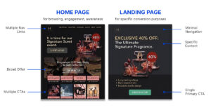
Once that visitor arrives, the next challenge is understanding what influences their decision to stay, trust the offer, and ultimately convert.
2. What Makes a Landing Page High-Converting?
Getting someone to visit a landing page is one thing. Getting them to take action is another.
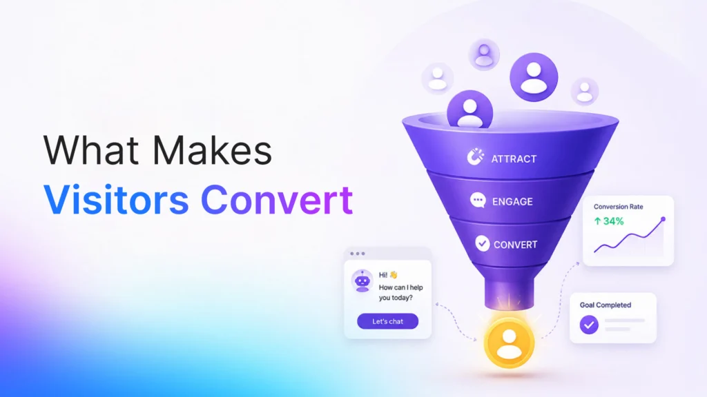
A high-converting landing page works because it makes the visitor’s decision clear, relevant, and easy. Every element contributes to answering the questions a visitor is silently asking: Is this relevant to me? Can I trust it? Is it worth it? What happens if I take the next step?
At the core of this is visitor intent.
Match the Visitor’s Intent
People arrive on landing pages with different levels of intent. Someone who clicked an advertisement for a specific product already has an expectation about what they will find.
If the page delivers something completely different, confusion follows.
This is known as message match—the consistency between the message that brings someone to the page and what they see when they arrive.
For example, if an ad promises a way to create landing pages faster, the landing page should immediately reinforce that promise rather than introducing an unrelated message.
Make the Value Obvious
Visitors shouldn’t have to work hard to understand why an offer matters.
A strong page quickly communicates:
What it offers → Who it is for → What problem it solves → What the visitor can achieve
The more clearly the value is communicated, the less mental effort the visitor needs to make sense of the offer.
Build Trust Before Asking for Action
Conversion also depends on confidence.
A visitor may understand an offer but still hesitate because they don’t know whether the product works, whether the company is credible, or whether the promised outcome is realistic.
Elements such as customer testimonials, reviews, recognizable client logos, case studies, product demonstrations, and clear information can reduce that uncertainty.
Reduce Friction
Every unnecessary step or source of confusion can make conversion harder.
Friction can come from:
- Complicated forms
- Unclear instructions
- Too many choices
- Unexpected costs
- Slow-loading pages
- Distracting navigation
- Unclear next steps
Reducing these obstacles doesn’t mean removing every piece of information. It means making the decision process easier.
Understand Why People Take Action
Ultimately, conversion isn’t just about design or copy in isolation. It’s about how visitors perceive the offer and make decisions.
Relevance gets their attention.
Value gives them a reason to continue.
Trust reduces uncertainty.
Low friction makes action easier.
This is why understanding the psychology of landing page conversion matters just as much as the individual elements placed on the page. When these factors work together, the landing page feels less like a collection of sections and more like a natural path toward a decision.
3. The Essential Elements of a High-Converting Landing Page
A landing page can look completely different depending on the campaign, audience, and offer. But the strongest pages usually contain a few core elements that help visitors understand the offer, evaluate it, and move toward a decision.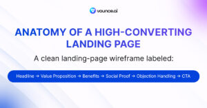
Think of these elements as the conversion architecture of the page.
1. Hero Section
The hero section is the first area visitors see, often above the fold.
It should quickly establish what the page is about and what the visitor can expect.
A strong hero typically includes:
- A clear headline
- Supporting subheadline
- Primary CTA
- Relevant visual or product image
- Key value proposition
The goal isn’t to explain everything immediately. It’s to give visitors enough context to understand the offer and continue down the page.
2. Value Proposition
Your value proposition explains why the offer is worth the visitor’s attention.
It should communicate the primary benefit without forcing visitors to piece the information together themselves.
A good value proposition connects the offer with a meaningful problem, need, or desired outcome.
3. Benefits and Features
Features explain what a product or service does. Benefits explain why that matters to the customer.
For example:
Feature: Automated landing page creation
Benefit: Spend less time building pages manually
The most effective pages don’t simply list capabilities. They connect those capabilities to outcomes that matter to the target audience.
4. Relevant Visuals
The right visual can communicate information faster than a paragraph of text.
Depending on the offer, this could be:
- Product screenshots
- Interface previews
- Demonstration videos
- Illustrations
- Before-and-after examples
- Relevant photography
Visuals should reinforce the message rather than exist purely for decoration.
5. Social Proof
Visitors are more likely to trust an offer when they can see evidence that others have found value in it.
Social proof can include:
- Customer testimonials
- Reviews
- Case studies
- Customer logos
- Ratings
- Results or statistics
The strongest proof is specific and credible rather than vague claims about being “the best.”
6. Lead Form or Conversion Point
If the goal is lead generation, the form is where the conversion actually takes place.
Keep it appropriate to the value of the offer. Asking for unnecessary information can create friction and reduce completion rates.
For other goals, this may be a signup button, purchase action, booking form, or another conversion point.
7. Objection Handling
Visitors often have concerns before taking action.
A landing page can address these concerns through:
- FAQs
- Pricing information
- Guarantees
- Security details
- Product demonstrations
- Clear explanations of what happens next
Addressing uncertainty at the right moment can make the difference between hesitation and action.
8. A Clear Call to Action
The CTA tells visitors what to do next.
Whether it’s “Start Free Trial,” “Book a Demo,” “Get the Guide,” or another action, it should be easy to understand and aligned with the offer.
A landing page doesn’t need dozens of different actions. A focused primary CTA helps keep the visitor journey clear.
4. How to Write Landing Page Copy That Converts
Once the structure of a landing page is clear, the next challenge is communicating the offer in a way that makes its value easy to understand.
Good landing page copy doesn’t try to say everything. It focuses on the information a visitor needs to understand the offer and make a decision.
Start With the Problem
Instead of opening with a long description of your company or product, connect the message to the problem your audience is trying to solve.
For example, instead of:
An advanced platform with powerful marketing capabilities
a more useful approach could be:
Launch campaign landing pages without spending hours building them from scratch.
The second version gives the visitor a clear reason to keep reading.
Use the Feature → Benefit → Outcome Model
Features explain what something does. Benefits explain why it matters. Outcomes show what the visitor can ultimately achieve.
For example:
Feature: AI-generated landing pages
Benefit: Build pages faster
Outcome: Launch and test campaigns sooner
This framework helps prevent copy from becoming a simple list of product capabilities.
Use Proven Copywriting Frameworks
Frameworks can give your landing page copy a logical flow.
AIDA stands for:
Attention → Interest → Desire → Action
It starts by getting attention, develops interest, creates a reason to want the offer, and leads toward the next step.
Another useful framework is PAS:
Problem → Agitate → Solution
It begins with the visitor’s problem, highlights why it matters, and then introduces the solution.
These frameworks aren’t rigid formulas. They’re useful starting points for organizing the message around how people evaluate an offer.
Make the Copy Easy to Scan
Visitors rarely read every word on a landing page.
Use short paragraphs, descriptive subheadings, bullet points, and strategically emphasized text to make important information easy to find.
The goal isn’t to make the copy shorter at all costs. It’s to make the important information easier to understand.
Write CTAs Around the Action
Your CTA should clearly communicate what happens next.
Instead of generic wording such as “Submit” or “Click Here,” use language connected to the actual action or benefit:
- Start Free Trial
- Book a Demo
- Get the Guide
- Create Your Page
- See How It Works
The CTA should feel like the natural conclusion of the message that comes before it.
Write for the Visitor, Not the Business
One of the simplest ways to improve landing page copy is to shift the focus from “what we do” to “what the visitor gets.”
Instead of filling the page with company descriptions and product features, prioritize the problems, outcomes, questions, and concerns that matter to the audience.
When visitors can quickly understand what the offer does, why it matters, and what they can do next, the copy has done its job.
5. Landing Page Design Best Practices for Higher Conversions
A landing page can have strong messaging and still underperform if the design makes that message difficult to understand or act on.
Good landing page design isn’t about adding more visual elements. It’s about creating a clear experience that helps visitors move through the page without unnecessary distractions.
Create a Clear Visual Hierarchy
Visitors should be able to identify the most important information quickly.
Use differences in size, spacing, typography, and placement to establish a clear order:
Main message → Supporting information → Proof → Action
The most important elements should naturally attract attention first, while secondary information should support rather than compete with them.
Design the Above-the-Fold Area Carefully
The above-the-fold area is what visitors see before they scroll.
It doesn’t need to contain every important detail. It needs to give visitors enough context to understand what they’re looking at and why continuing is worthwhile.
Keep the initial view focused on the core message, relevant visual content, and the primary action.
Use Visuals to Explain, Not Decorate
Images, screenshots, videos, and illustrations should have a clear purpose.
A product screenshot can show how a tool works. A before-and-after image can demonstrate a result. A short video can explain something that would otherwise require several paragraphs.
When a visual doesn’t add information or reinforce the message, it may simply become another distraction.
Make the Page Easy to Use on Mobile
A large percentage of campaign traffic can come from mobile devices, so responsive design is essential.
Check that:
- Text remains readable
- Buttons are easy to tap
- Forms are simple to complete
- Images scale correctly
- Sections don’t feel cramped
- Important content doesn’t require excessive scrolling
A page should feel intentionally designed for smaller screens rather than like a desktop page squeezed onto a phone.
Keep Performance in Mind
Design also affects how quickly a page loads.
Large images, unnecessary animations, excessive scripts, and poorly optimized assets can slow down the experience.
Pay attention to page speed and Core Web Vitals, particularly when the landing page is being used for paid campaigns where visitors may leave before the page has fully loaded.
Remove Unnecessary Distractions
Every element competes for attention.
If a navigation menu, animation, pop-up, secondary CTA, or decorative element doesn’t support the visitor’s journey, consider whether it needs to be there.
The strongest landing page designs aren’t necessarily the most elaborate. They’re the ones where every important element has a reason to exist.
6. How to Create a High-Converting Landing Page Step by Step
Once you understand the strategy, structure, copy, and design, the actual creation process becomes much more straightforward.
The key is to build the page in the right order instead of jumping between copy, design, and technical details.
Step 1: Define the Goal
Start by deciding what the page needs to achieve.
Choose one primary conversion goal, such as:
- Generating leads
- Getting free-trial signups
- Booking demos
- Selling a product
- Collecting email addresses
This gives the rest of the page a clear direction.
Step 2: Define the Audience
Identify who will arrive on the page and what they are looking for.
Consider their problem, motivation, level of awareness, and what might prevent them from taking action.
This helps you create a page that feels relevant to the person seeing it rather than a generic page aimed at everyone.
Step 3: Define the Offer
Decide exactly what you’re giving the visitor and why it is valuable.
The offer could be a product, free trial, consultation, downloadable resource, discount, or another action.
Be specific about what the visitor gets and what makes the offer worth their attention.
Step 4: Map the Page Structure
Before writing or designing, decide what information the visitor needs and in what order.
A typical structure might be:
Hero → Benefits → Features → Proof → Objections → CTA
The structure should follow the visitor’s decision-making process rather than simply copying a standard template.
Step 5: Write the Content
Create the headline, supporting copy, benefits, proof, objection-handling content, and CTA.
Keep the messaging consistent with the campaign that brought visitors to the page.
At this stage, focus on making the message clear before worrying about visual details.
Step 6: Design the Experience
Turn the content into a visual layout using appropriate typography, spacing, imagery, sections, and conversion points.
Make sure the design supports the hierarchy of information and doesn’t distract from the primary goal.
Step 7: Build and Check the Page
Before publishing, check the practical details.
Test:
- Forms
- Buttons
- Links
- Mobile responsiveness
- Page speed
- Images
- Tracking
- Browser compatibility
A small technical problem can prevent an otherwise effective landing page from converting.
Step 8: Launch and Measure
Once the page is live, start collecting data.
Monitor conversions, traffic sources, CTA interactions, form submissions, and visitor behavior.
Don’t judge the page only by how it looks. Performance comes from what visitors actually do.
Step 9: Improve
Use the data to identify opportunities for improvement.
You might discover that visitors are leaving at a particular section, abandoning a form, or responding better to one version of the page.
Those insights can then become the basis for the optimization and testing process covered in the next section.
The result is a repeatable workflow:
Goal → Audience → Offer → Structure → Content → Design → Build → Launch → Measure → Improve.
7. Landing Page Optimization and A/B Testing
Publishing a landing page is not the end of the process. Once visitors start arriving, you can use their behavior and conversion data to understand what is working and where improvements may be needed.
This is where conversion rate optimization (CRO) comes in.
Start With Conversion Data
The first step is understanding how visitors interact with the page.
Depending on your goal, useful metrics can include:
- Conversion rate
- CTA click-through rate
- Form completion rate
- Form abandonment
- Bounce rate
- Traffic sources
- Mobile vs. desktop conversions
These numbers provide a starting point for identifying potential friction points.
For example, if a landing page receives substantial traffic but very few visitors complete the form, the issue may be somewhere in the conversion experience rather than the traffic itself.
Use Heatmaps to Understand Behavior
Analytics can tell you what visitors are doing. Tools such as heatmaps can help show where they are interacting with the page.
Heatmaps can reveal:
- Where visitors click
- How far they scroll
- Which areas receive the most attention
- Whether important content is being ignored
- Where visitors may stop engaging
This can help identify sections that may need to be simplified, repositioned, or clarified.
Run A/B Tests
A/B testing compares two versions of a page or a specific element to determine which performs better.
You could test:
- Headlines
- Offers
- CTA wording
- Images
- Form length
- Page layouts
- Social proof
- Different sections
For example, you might test two different headlines to see which one produces more signups.
The important part is to have a clear reason for the test rather than changing elements randomly.
Optimization Is an Ongoing Process
There is rarely a single version of a landing page that will remain optimal forever.
As your audience, campaigns, offers, and traffic sources change, visitor behavior can change too.
The goal isn’t to constantly redesign the page. It’s to create a continuous cycle:
Measure → Identify → Test → Learn → Improve
Over time, these informed improvements can turn a landing page from something that simply receives traffic into a stronger conversion asset.
8. Landing Pages for Google Ads, Lead Generation, and SaaS
Not every landing page needs the same structure. The source of the traffic, the visitor’s intent, and the conversion goal should determine what information the page prioritizes.
Google Ads Landing Pages
Visitors coming from Google Ads have already expressed an interest through a search or advertisement. The landing page should therefore continue the same message.
This is where message match becomes particularly important.
If an ad promotes “AI landing page creation,” the page should immediately reinforce that topic rather than sending visitors to a generic page with unrelated information.
A strong Google Ads landing page should align the:
Search query → Ad → Landing page → Conversion
This consistency can make the experience more relevant and reduce the disconnect between what visitors expected and what they actually find.
Lead Generation Landing Pages
Lead generation pages are built around collecting visitor information.
The offer might be:
- A free consultation
- Ebook or guide
- Webinar registration
- Free resource
- Quote or estimate
- Product demo
- Free trial
The key is creating enough perceived value for the visitor to exchange their information.
The form itself should also match the offer. A simple resource download may not justify a long form, while a sales consultation may require more information.
SaaS Landing Pages
SaaS products often require more explanation because visitors need to understand both what the software does and how it can help them.
A SaaS landing page may include:
- Product screenshots
- Feature explanations
- Key benefits
- Use cases
- Customer testimonials
- Case studies
- Pricing
- FAQs
- Free-trial or demo options
The page should help potential customers understand how the product fits into their workflow and whether it is appropriate for their needs.
Match the Page to the Campaign
The same product may need several landing pages for different campaigns.
A Google Ads visitor searching for a specific solution may need a highly focused page. A lead-generation campaign may need a stronger lead magnet. A SaaS trial page may need more product information and proof.
There is no single landing page template that works for every situation.
The most effective approach is to build the page around the visitor’s intent, the campaign’s promise, and the action you want them to take.
9. Landing Page SEO: How to Get More Organic Traffic
A landing page can generate results from paid campaigns, but it can also attract visitors through organic search when it is built around the right topics and search intent.
Landing page SEO is about making the page understandable and useful for both search engines and the people searching for your solution.
Start With Search Intent
Before choosing keywords, understand what the searcher is actually looking for.
For example, someone searching for “how to create a landing page” is looking for information, while someone searching for “landing page builder” may be looking for a tool or solution.
Your page should match that intent rather than simply inserting a keyword throughout the content.
Choose Relevant Keywords
Focus on a primary topic and support it with closely related terms.
For a landing page guide, relevant keywords might include:
- Landing page
- High-converting landing page
- Landing page optimization
- Landing page design
- Landing page builder
- Landing page conversion rate
- Conversion rate optimization
- Landing page best practices
Use keywords naturally in the page title, H1, subheadings, copy, URL, and other relevant elements.
Optimize On-Page Elements
Important SEO elements include:
- SEO title
- Meta description
- H1 and supporting headings
- URL structure
- Relevant internal links
- Image alt text
- Naturally integrated keywords
These elements help search engines understand the topic of the page while also giving users a clearer idea of what they’ll find.
Don’t Sacrifice Conversion for SEO
A common mistake is optimizing a landing page so heavily for search engines that the actual visitor experience suffers.
Keyword repetition, awkward sentences, or unnecessary sections can make the page harder to read.
SEO should support the page’s purpose—not replace it.
A visitor who finds your page through search still needs a clear, useful experience once they arrive.
Improve Technical Performance
Technical performance also matters.
Pay attention to:
- Mobile responsiveness
- Page loading speed
- Image compression
- Core Web Vitals
- Crawlability and indexability
- Clean page structure
A technically sound page provides a better experience for visitors and gives search engines fewer obstacles when understanding and accessing the content.
Build Internal Links
Related content can strengthen both the user’s journey and your site’s overall topical structure.
For example, a guide about landing page creation can link naturally to related content about conversion psychology, keyword research, CRO, or page speed optimization.
This helps visitors discover useful information while creating stronger connections between related pages.
Monitor Search Performance
After publishing, use tools such as Google Search Console to see which queries are generating impressions and clicks.
You may discover that your page is appearing for searches you weren’t originally targeting. Those insights can reveal opportunities to improve the content, expand relevant sections, or create supporting articles.
Ultimately, effective landing page SEO comes down to one principle:
Create a page that satisfies the searcher’s intent first, then optimize it so search engines can understand and discover it.
10. How AI Is Changing Landing Page Creation
Creating a landing page has traditionally involved several separate tasks: planning the structure, writing the copy, designing the layout, finding visuals, and then putting everything together.
AI is bringing those steps closer together.
Instead of starting with a blank page, marketers can now describe a campaign, product, audience, or offer and use AI to generate a working starting point. This can significantly reduce the time between having an idea and having a page ready to test.
From Idea to Landing Page Faster
AI landing page builders can generate much of the initial structure from a simple description.
For example, instead of manually creating every section, a marketer can provide details about the audience, offer, and campaign goal and receive a page containing elements such as:
- Hero section
- Headlines and supporting copy
- Benefits
- Feature sections
- CTAs
- Forms
- Supporting visuals
Tools such as Vounce take this approach further by helping turn a landing page concept into a working page in minutes, giving marketers something they can refine rather than building everything from scratch.
AI Can Speed Up the Repetitive Work
AI can assist with more than page layouts.
It can help marketers:
- Generate initial landing page copy
- Create headline variations
- Structure sections
- Adapt messaging for different audiences
- Develop CTA variations
- Turn campaign ideas into page concepts
- Create different versions for testing
This can be especially useful when running multiple campaigns that require different landing pages.
AI Doesn’t Replace the Strategy
Speed alone doesn’t make a landing page effective.
AI can produce a page, but marketers still need to decide whether the offer is compelling, the messaging is relevant, the positioning is right, and the experience makes sense for the intended audience.
Generated copy may also need editing to sound specific to the brand rather than generic.
The strongest approach is to use AI for the work it can accelerate while keeping human judgment at the center of the marketing strategy.
A Faster Testing Cycle
Perhaps the biggest advantage isn’t simply creating one page faster. It’s making it easier to experiment.
When creating a new version takes less time, marketers can test more ideas around messaging, structure, offers, and positioning.
The process becomes:
Idea → Build → Launch → Measure → Improve
AI doesn’t remove the need for good landing page strategy. It reduces the distance between the strategy and its execution.
For marketers, that means spending less time on the repetitive process of assembling a page and more time deciding what the page should achieve and how it can perform better.
11. Common Landing Page Mistakes to Avoid
Even when a landing page has all the right components, small mistakes can make the experience harder to understand or reduce the likelihood of conversion.
Here are some of the most common issues to check before launch.
1. Unclear Messaging
Visitors should quickly understand what the page is offering and whether it is relevant to them. Vague headlines and generic copy can create confusion from the start.
2. Too Many Conversion Goals
A page promoting a free trial, asking visitors to book a demo, download a guide, follow social accounts, and explore multiple products can create competing priorities.
Keep the primary goal clear.
3. Poor Message Match
If the landing page doesn’t deliver on the promise made in the advertisement, email, or search result that brought the visitor there, the experience can feel disconnected.
The page should reinforce the expectation created before the click.
4. Too Much Friction
Long forms, complicated processes, unnecessary fields, and unclear instructions can make taking action feel harder than it needs to be.
Remove steps that don’t contribute to the conversion.
5. Weak Trust Signals
Visitors may hesitate when there is little evidence supporting the claims being made.
Relevant testimonials, reviews, customer examples, case studies, or other forms of proof can help reduce uncertainty.
6. Ignoring Mobile Experience
A page that looks good on a desktop can still provide a poor experience on a phone.
Check text size, buttons, forms, spacing, images, and overall usability across screen sizes.
7. Slow Page Speed
A visitor shouldn’t have to wait several seconds just to see the page.
Large images, unnecessary scripts, and heavy animations can negatively affect both the experience and performance.
8. Designing Without Testing
A page may look convincing to the person who created it but perform differently with real visitors.
Use analytics and testing to validate important decisions rather than relying entirely on personal preference.
9. Adding Content Without a Purpose
More sections don’t necessarily make a landing page more persuasive.
Every element should contribute to understanding the offer, building confidence, addressing an objection, or moving the visitor toward the intended action.
10. Treating the First Version as the Final Version
Even a strong landing page can have opportunities for improvement.
Once enough data is available, use visitor behavior and conversion results to identify what should be tested or refined.
The common thread behind these mistakes is simple: anything that creates confusion, distraction, or unnecessary effort can work against conversion. A focused landing page makes the intended journey easier to understand and easier to complete.
12. High-Converting Landing Page Checklist
Before publishing a landing page, use this quick checklist to make sure the page is clear, focused, and ready for visitors.
Strategy
- Is there one clear conversion goal?
- Is the target audience clearly defined?
- Does the offer address a specific need?
- Does the page match the visitor’s intent?
Copy
- Is the main value easy to understand?
- Does the copy focus on benefits and outcomes?
- Is the content easy to scan?
- Are important objections addressed?
- Is the CTA clear and relevant?
Design & UX
- Is the visual hierarchy easy to follow?
- Is the important information visible above the fold?
- Are visuals relevant to the offer?
- Is the page easy to use on mobile?
- Are unnecessary distractions removed?
Conversion
- Is the primary action easy to find?
- Does the form ask only for necessary information?
- Is there enough relevant social proof?
- Are there obvious friction points?
- Is it clear what happens after the visitor converts?
SEO & Performance
- Is the page targeting a relevant search intent?
- Are the title, headings, and meta description optimized?
- Are images compressed and properly optimized?
- Does the page load quickly?
- Are Core Web Vitals and mobile performance acceptable?
- Are relevant internal links included?
Before & After Launch
- Do all buttons, forms, and links work?
- Is conversion tracking configured?
- Have the page and form been tested on different devices?
- Are you monitoring visitor behavior and conversions?
- Is there a plan for future testing and optimization?
A landing page doesn’t need to check every box to be effective. The checklist is there to catch avoidable problems before they cost you visitors or conversions.
// FAQs
Frequently Asked Questions
A high-converting landing page has a clear value proposition, compelling copy, a focused CTA, relevant visuals, trust signals, and a simple user journey. It should make it easy for visitors to understand the offer and take action.
Start by reviewing your headline, CTA, page structure, messaging, forms, and trust elements. Use analytics and A/B testing to identify what is preventing visitors from converting and make improvements based on actual behavior.
Most landing pages should include a clear headline, supporting subhead, relevant visuals, benefits, social proof or trust signals, and a prominent CTA. The exact elements depend on the campaign and audience.
Yes, when you want the page to attract organic search traffic. Use relevant keywords naturally, create useful content, optimize the title and headings, and make sure the page provides a good user experience.
Yes. AI can help with tasks such as generating copy, developing page structures, suggesting headlines and CTAs, and speeding up the creation process. However, the final page should still be reviewed and optimized based on your audience and performance data.